Circa
A private planner for friends: see who’s nearby, settle where and when by vote, and keep the chat, checklist and costs in one place.
- Role
- Product Designer
- Client
- Circa
- Services
- Product Design
- Scope
- More than 130 screens
The problem
Every group chat has the same dying conversation. Someone says we should all meet up, four people reply with a thumbs up, and nothing happens. The plan stalls because nobody owns the decisions: where, when, who’s bringing what, and who owes whom afterwards.
Circa gives each group of friends its own private space to settle all of that. The final product runs to more than 130 screens, covering the map, planning, group chat, shared costs and one-to-one meetups.
Plans don’t all start in the same place
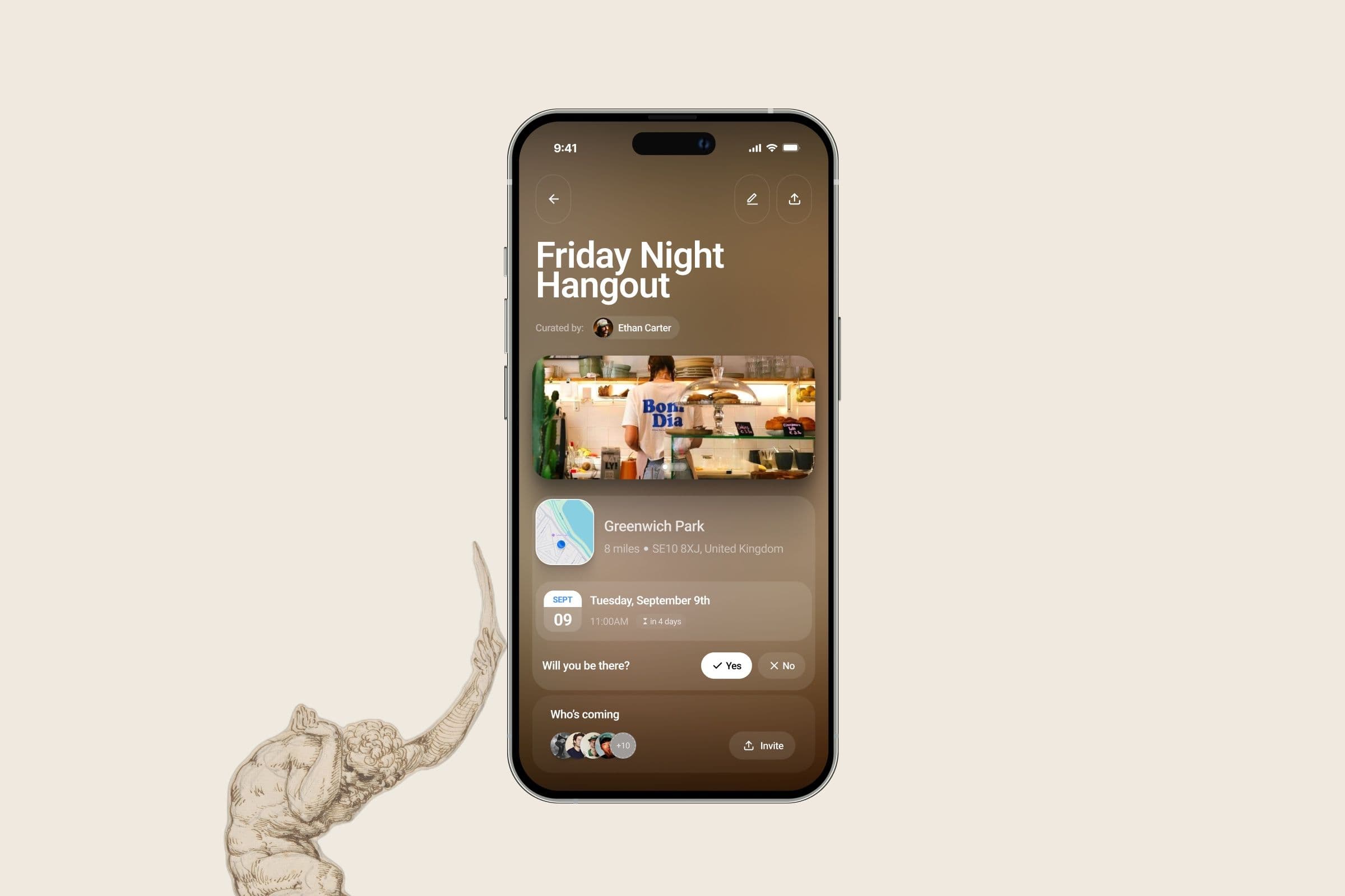
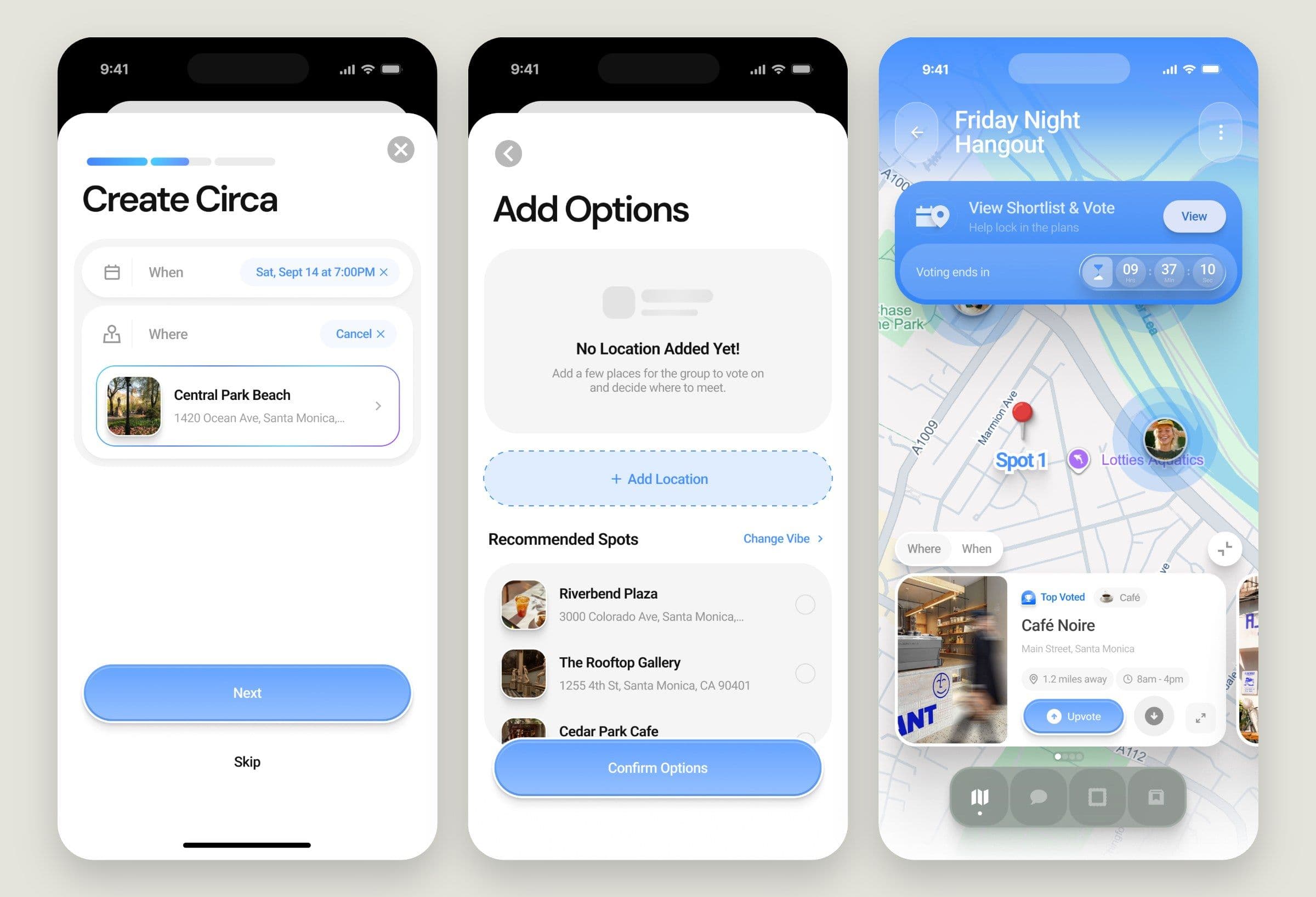
The decision I’d defend hardest is that creating a Circa doesn’t force one way of planning. Sometimes you know the place and the time. Sometimes you have three ideas and need a vote. Sometimes all you know is Saturday, somewhere near Greenwich.
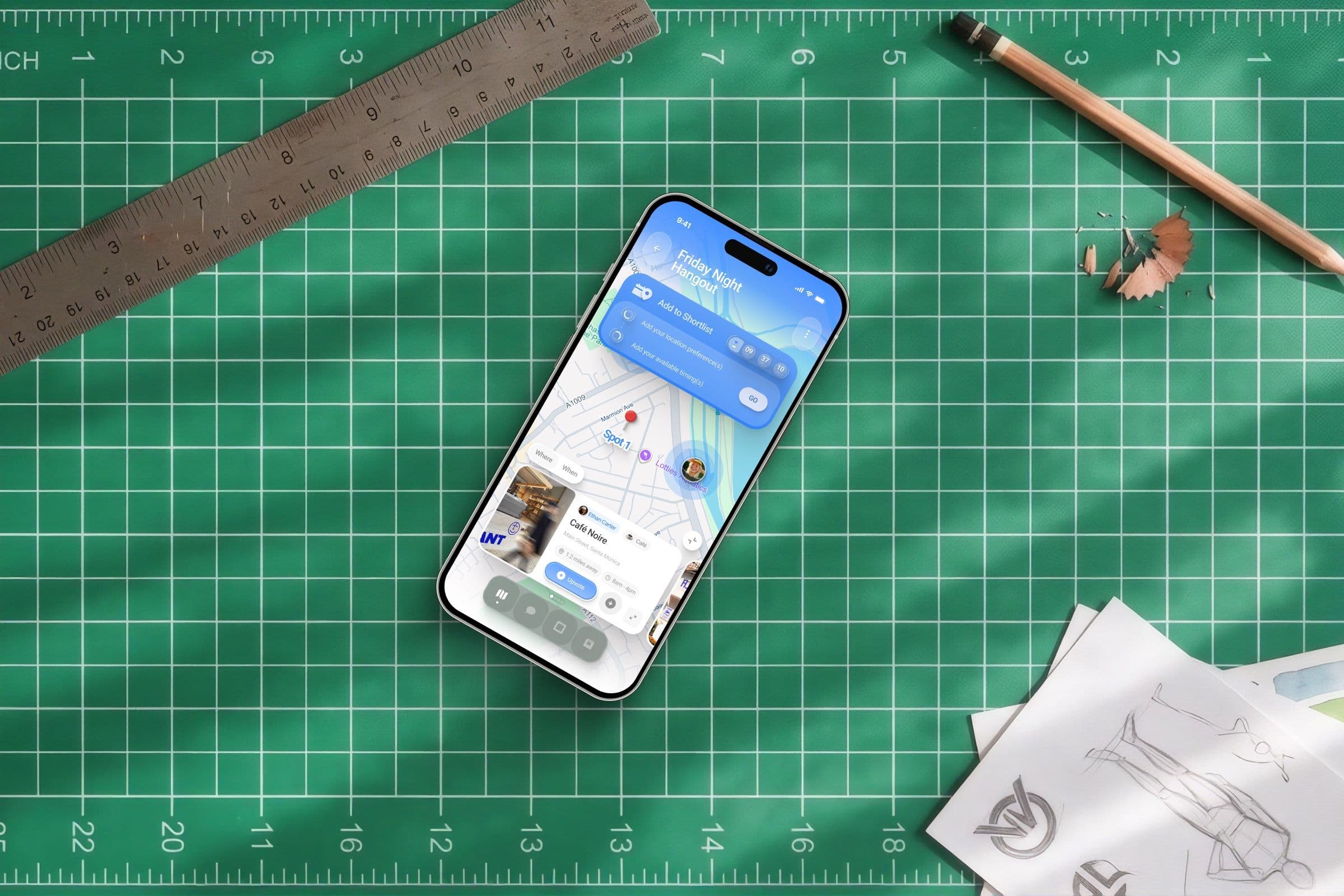
So there are three routes: fixed, options and flexible. A fixed plan takes seconds. An options plan builds a shortlist of places and times, with recommended spots to get it moving. A flexible plan pins down an area and leaves the rest to the group, and it can sync your calendar to show when you’re actually free.
Voting runs against a countdown, because a shortlist with no deadline is just a longer group chat.
The map does the talking
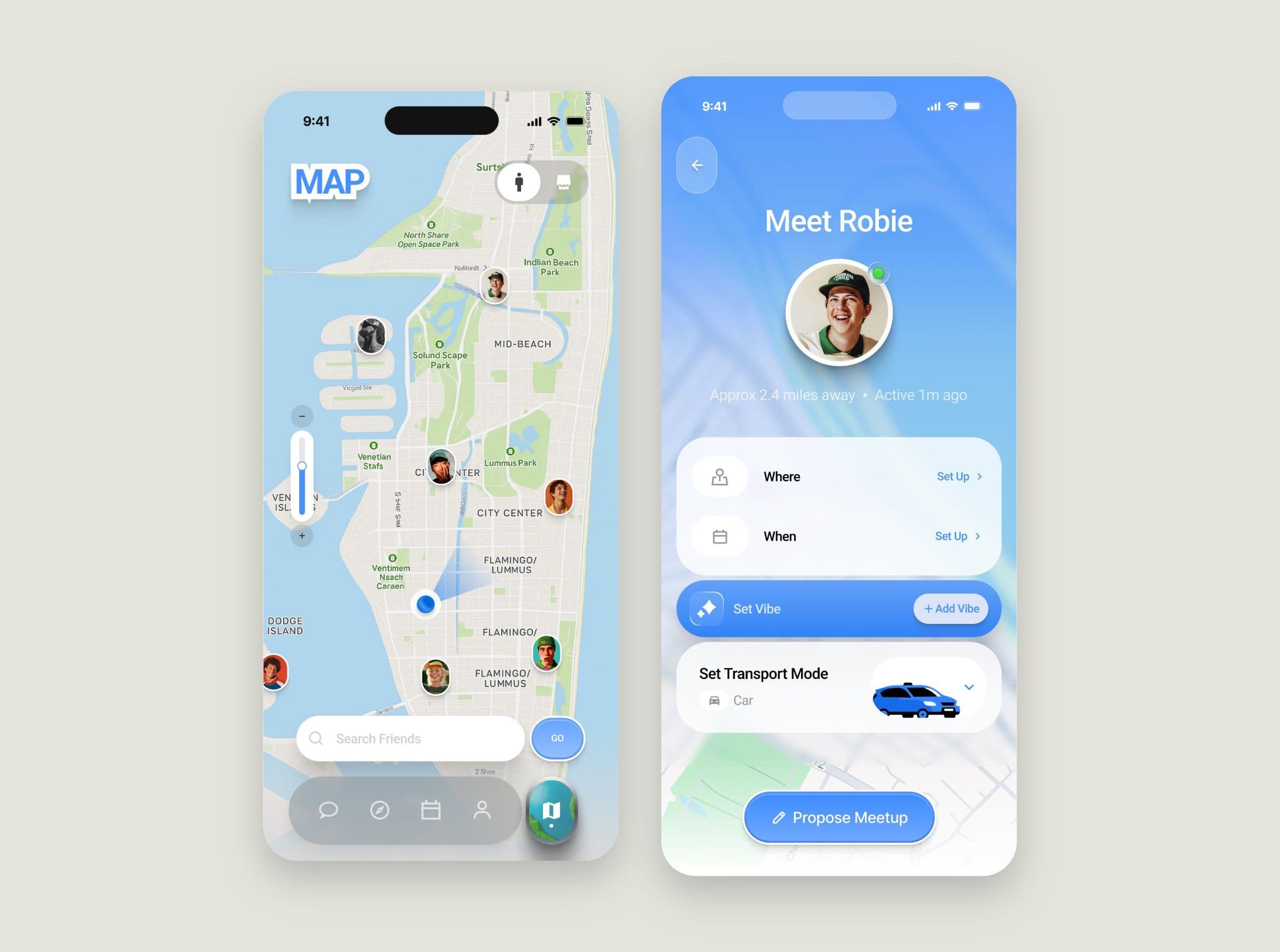
The map sits at the centre of the navigation, because distance is half the decision. You can see which friends are close, tap one and propose a meetup in a few steps, setting where, when, the vibe and how you’re getting there.
Location is the sensitive part of a product like this, so you choose your default view distance during onboarding, and only the groups you’re invited to see meetup details.
Everything after yes
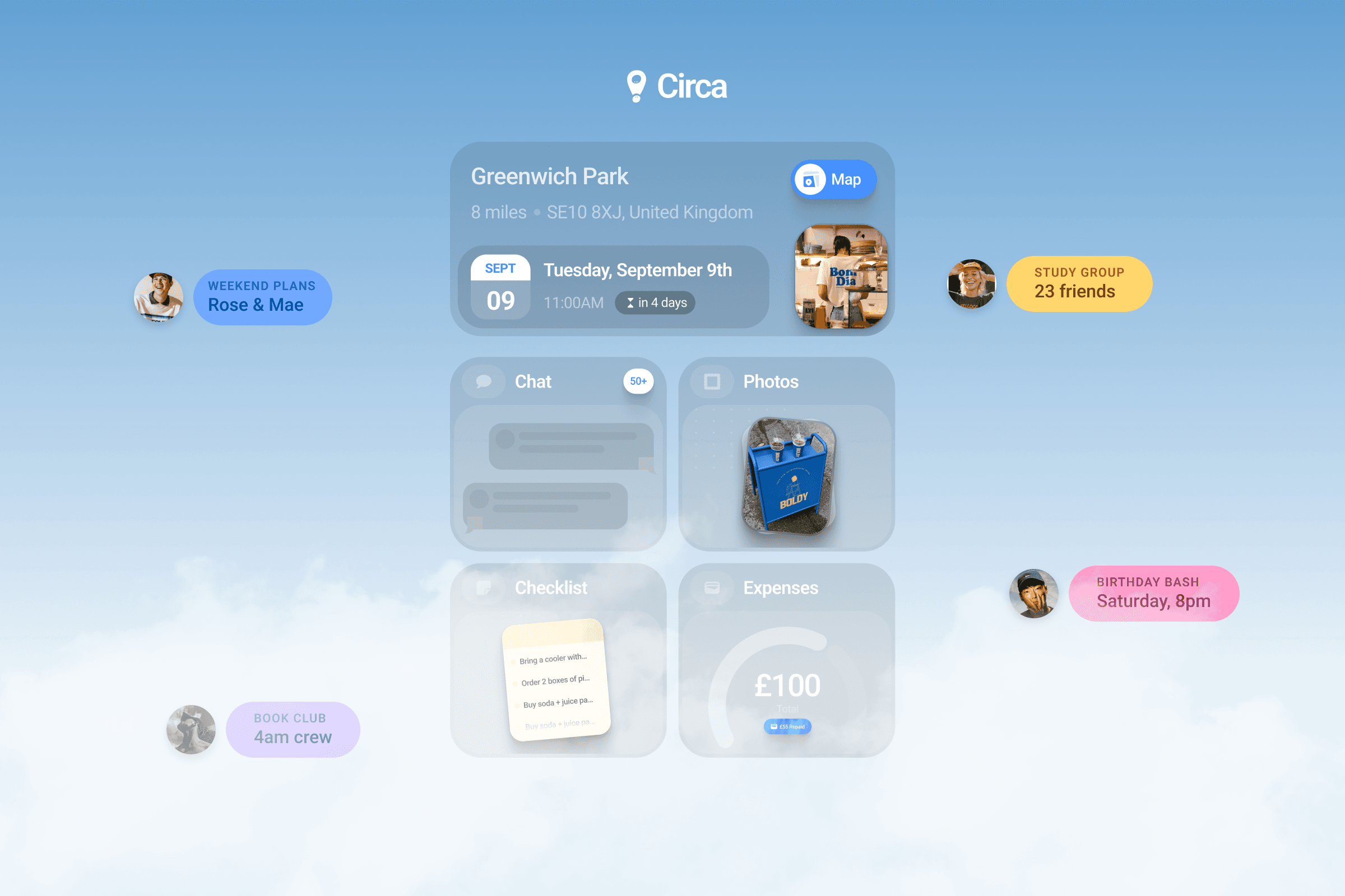
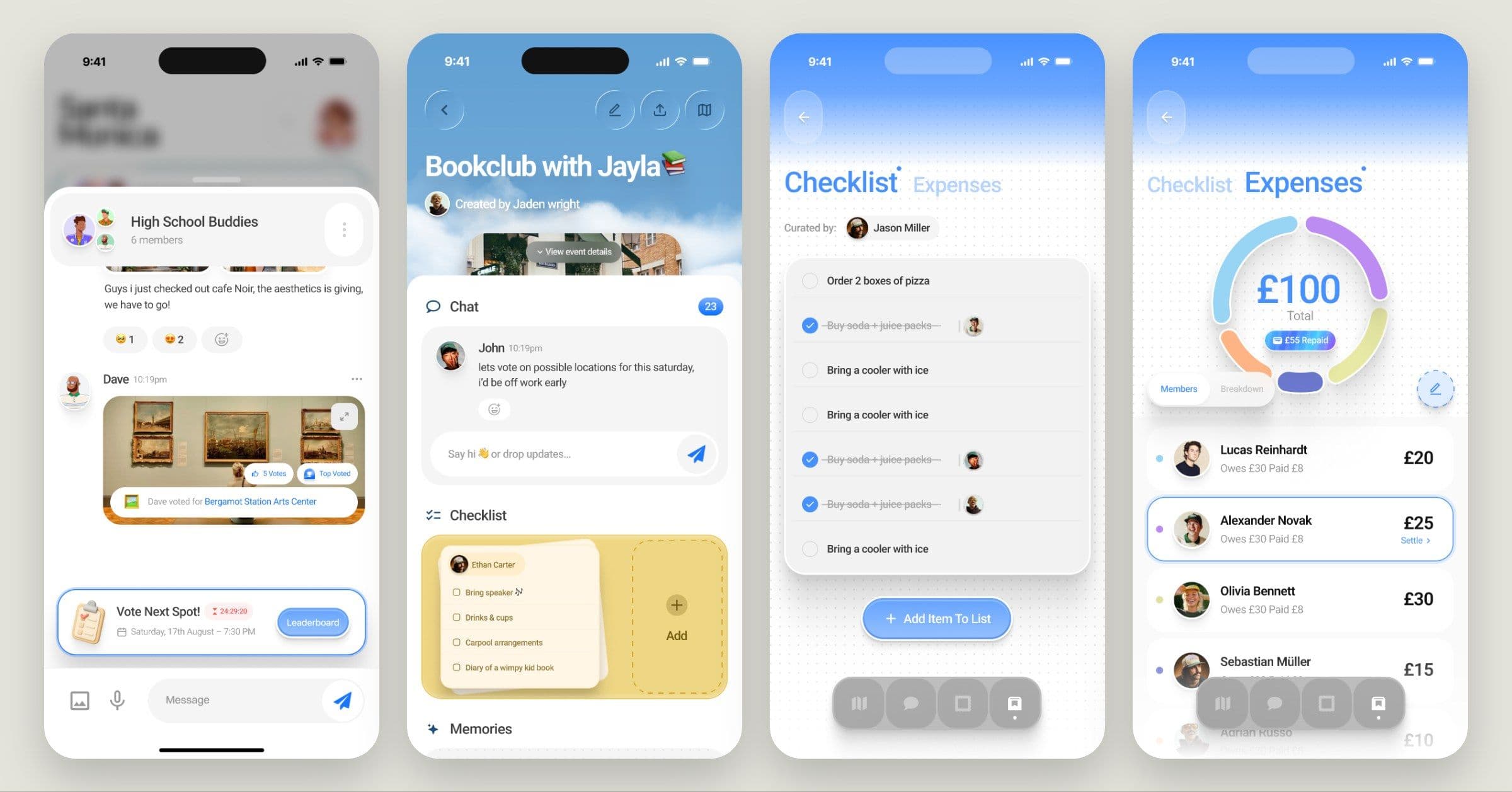
Agreeing is only half of it. Each Circa keeps the chat, checklist, memories, expenses and location on one page, so nobody has to dig through messages to find out who’s bringing the speaker or what they owe.
Votes land in the chat as cards, which means deciding happens where the group is already talking. Expenses show each person’s share and what’s left to settle at a glance, which spares someone the job of chasing their friends for money.
Before and after
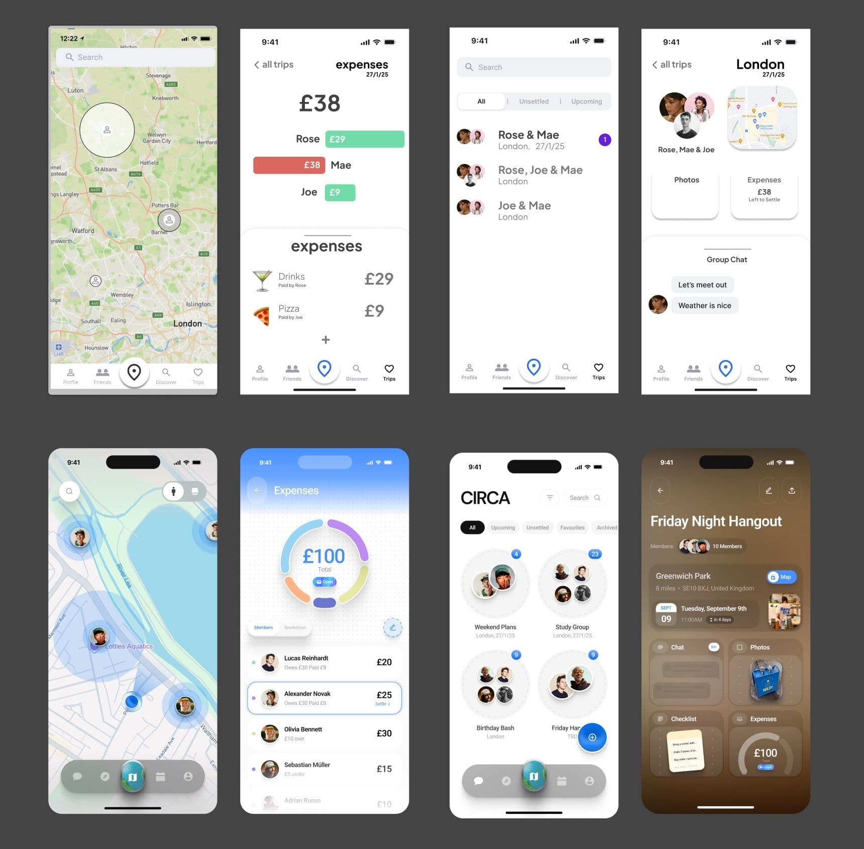
The earlier version had the right ideas and not much feeling. The map was a plain grid of pins, expenses were bar charts and trips were a list of names.
I rebuilt those screens around people: friends’ faces on the map, groups shown as clusters of the humans in them, an event page that gives each part of the plan its own room, and an expenses ring you can read in a second. It’s the same product underneath, and now it feels like somewhere you’d actually want to plan a night out.
“Dave is the best UX designer I’ve worked with so far. Timely, polite, inventive and professional, with a top-class finish right off the bat.” Joe Caplin, founder of Circa