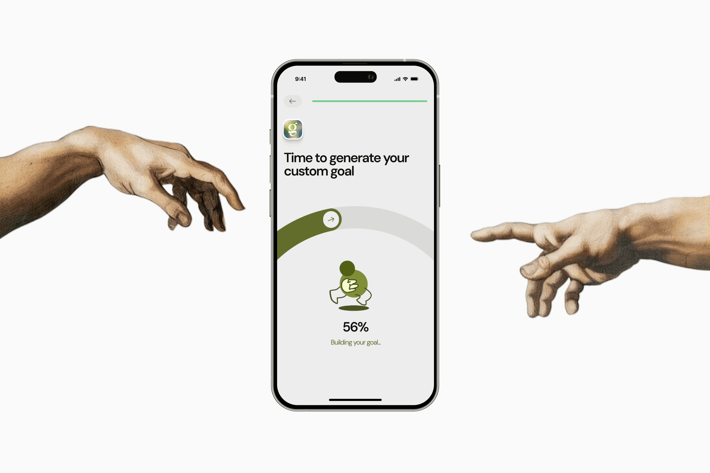
Goals
A fitness accountability app where you commit with friends, and every missed week sends your money to charity.
- Role
- Product Designer
- Client
- Studio Hemis
- Services
- Product Design, App Store Screenshots
- Results
- Thousands of users, 5.0 on the App Store
The problem
Most people don’t need another workout tracker. They know what they should be doing, and they stop anyway, usually around the time nobody’s watching. Goals goes after that moment. You commit to a weekly target with up to five friends, your phone logs the workouts for you, and if you miss the week, your money goes to a charity you picked.
That’s an easy idea to pitch and a hard one to design. Once money is on the line, every screen carries weight. A vague chart turns into a dispute, and a cold message turns into a deleted app. My job was to make a product with real stakes feel like it was on your side.
I designed all of it: more than 120 screens across 11 flows, the motion between them and the App Store set.
A commitment that feels like yours
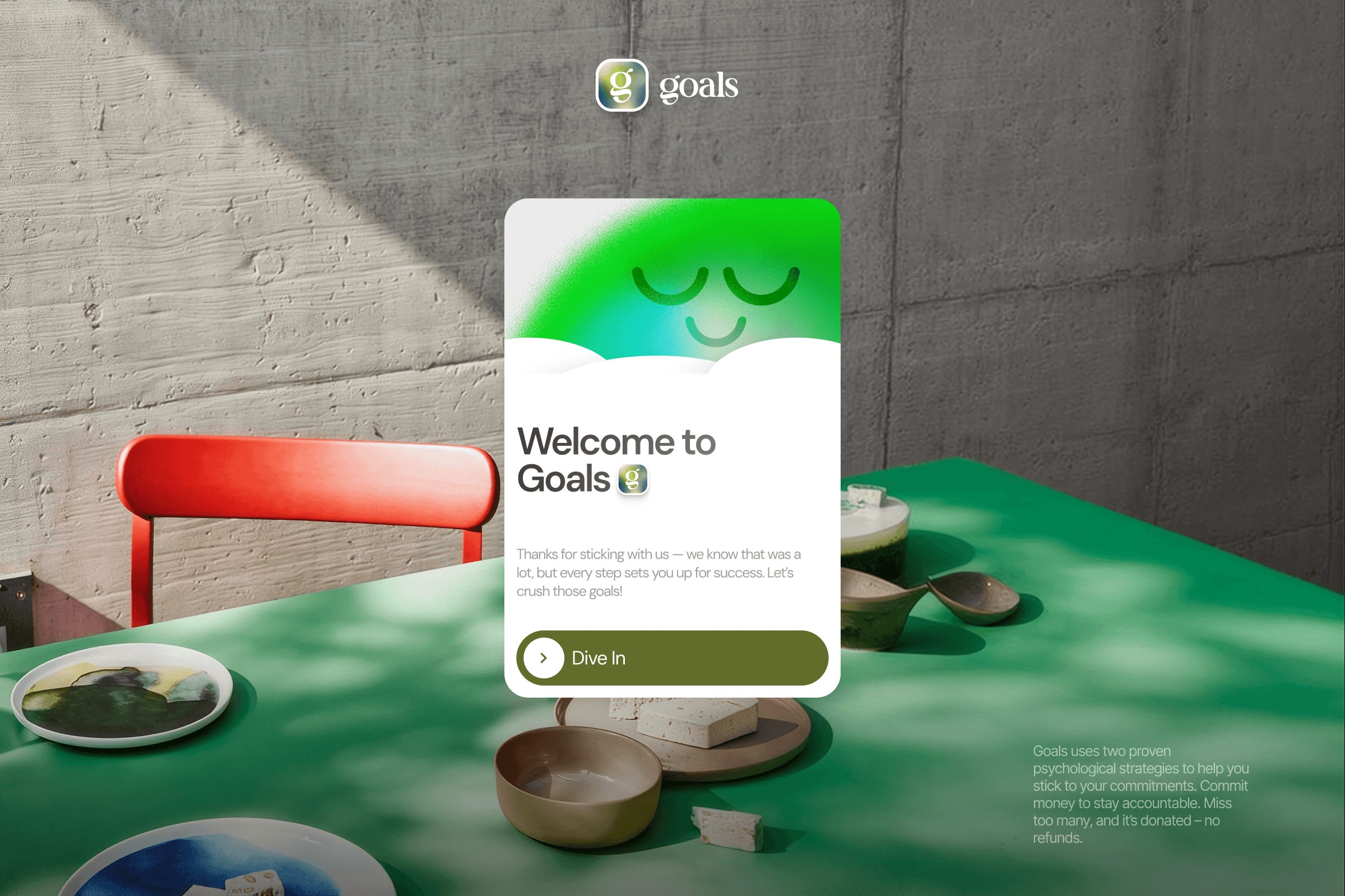
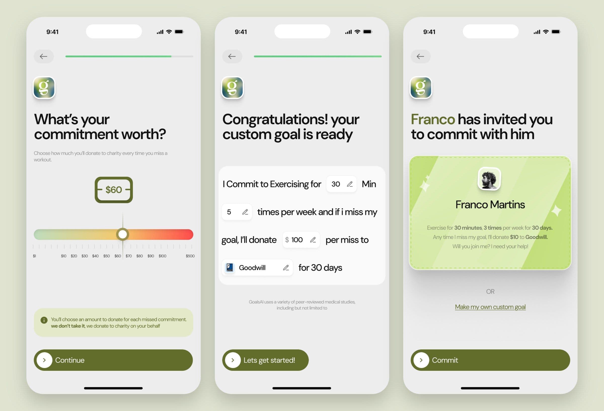
A goal someone hands you is easy to abandon, so onboarding builds one with you. It asks how often you train, what you’re after and what keeps getting in the way, then writes your goal back as one sentence: I commit to exercising for 30 minutes, 5 times per week, and if I miss my goal, I’ll donate $100 per miss to Goodwill, for 30 days.
Every value in that sentence can be edited where it sits. Written that way it reads like a promise, which is exactly what it is. The same sentence then becomes the invite you send a friend, so joining someone’s goal means signing up to their words.
Your own voice on a bad day
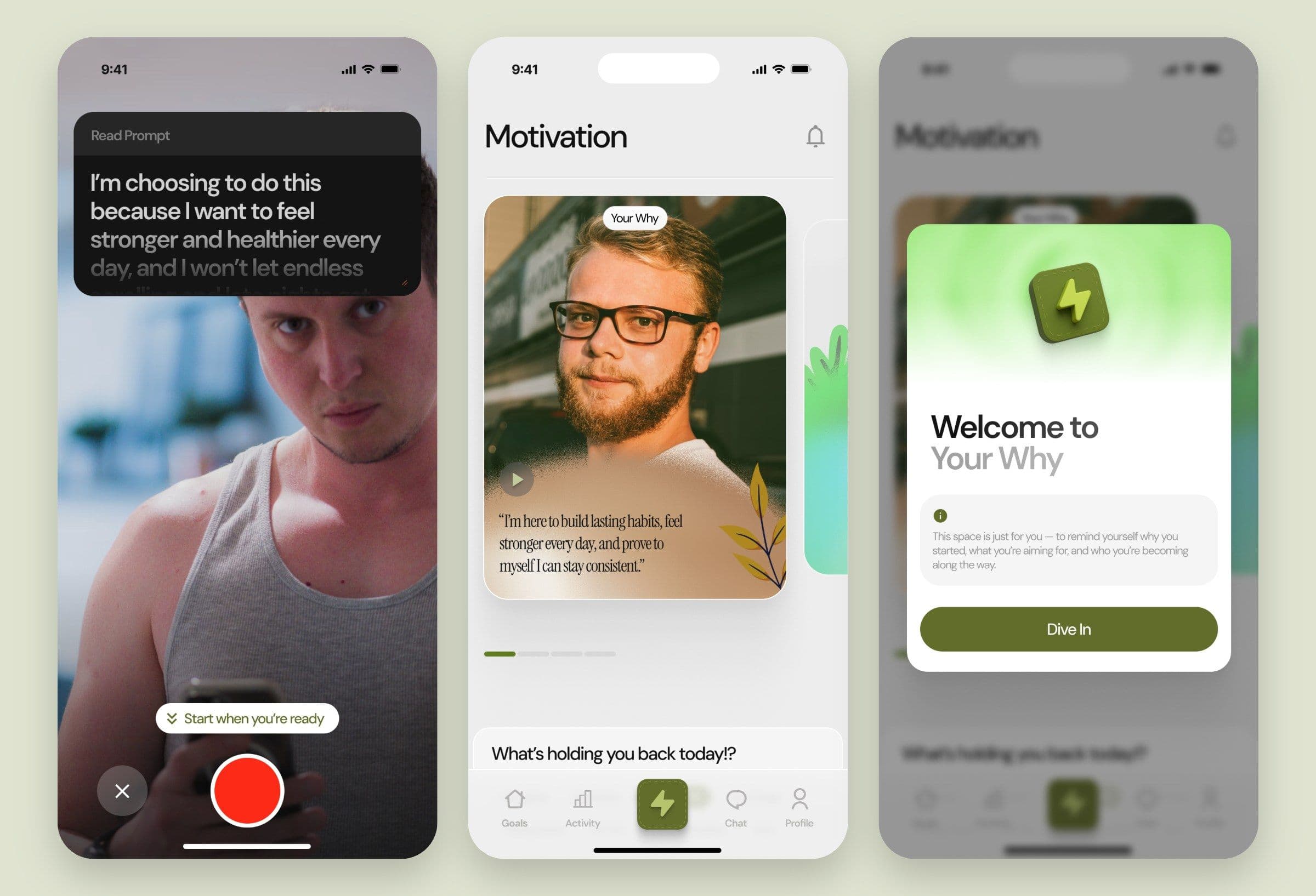
The feature I’m proudest of is also the simplest. During onboarding you record a short video to your future self, with a script on screen so nobody freezes in front of the camera. From then on, a Motivation button sits in the middle of the tab bar. Tap it when you’re flagging and you get yourself, explaining why you started.
Quotes are easy to scroll past. Your own face, three weeks ago, meaning it, is much harder to ignore.
A chart that settles the argument
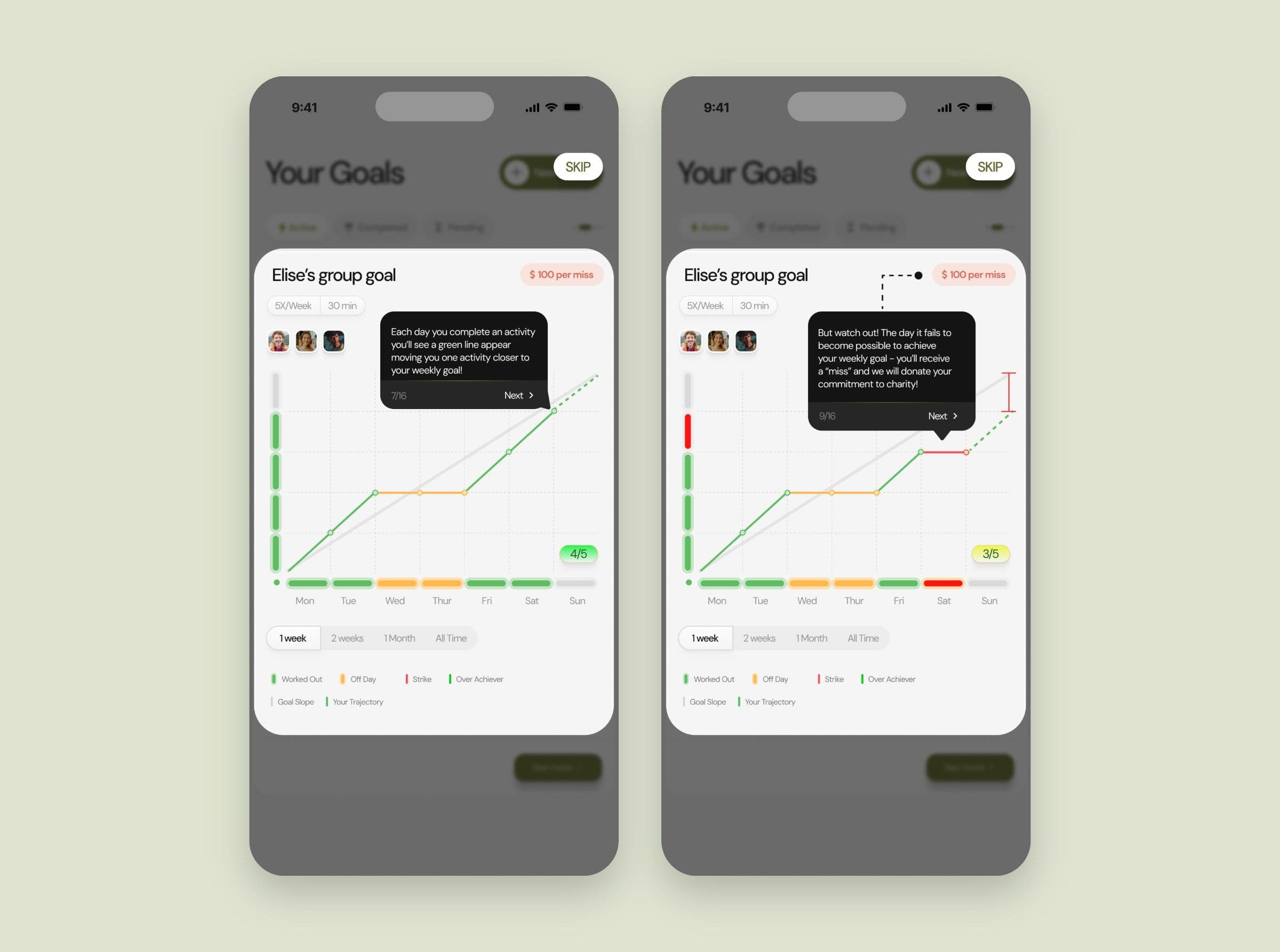
Because money moves when you miss, the progress chart has to be beyond dispute. Every week has a grey target line. Workout days push your line up in green, off days hold it flat in yellow, and the day the week can no longer be won, it turns red. You can see a miss coming before it lands, with your partners’ lines right there beside yours.
Workouts sync from Apple Health, so there’s nothing to log and nothing to fudge. A short tooltip tour explains all of this on your first run, right on the chart.
Bad news, handled well
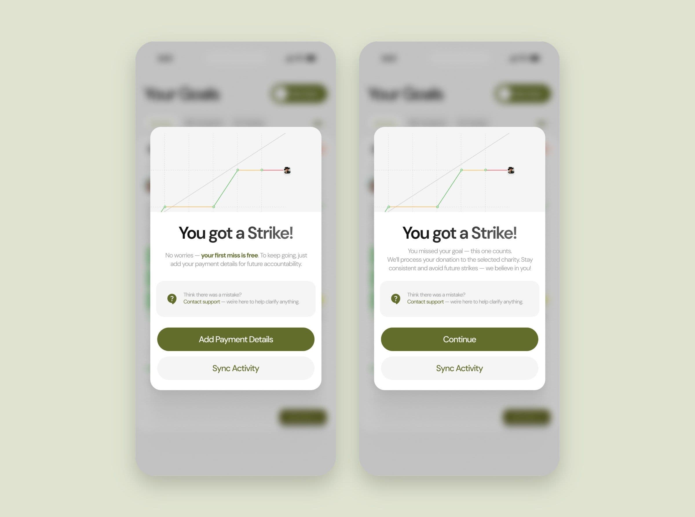
The strike is the moment this product keeps people or loses them. So your first miss is free, and the screen says so before it asks for payment details. New goals also start with a warm-up until Monday, where everything works but you can’t miss yet, which gives a group time to rally before anything counts.
After that, the app is straight with you about the charge, and it offers a route to support in the same breath in case the sync got it wrong. Nobody should have to hunt for help on the day they’ve just lost money.
Selling it in a few seconds
A charity penalty is an unusual premise to explain on an App Store listing, where you get a few seconds of someone’s thumb. I gave each screenshot one idea and let the product do the talking.
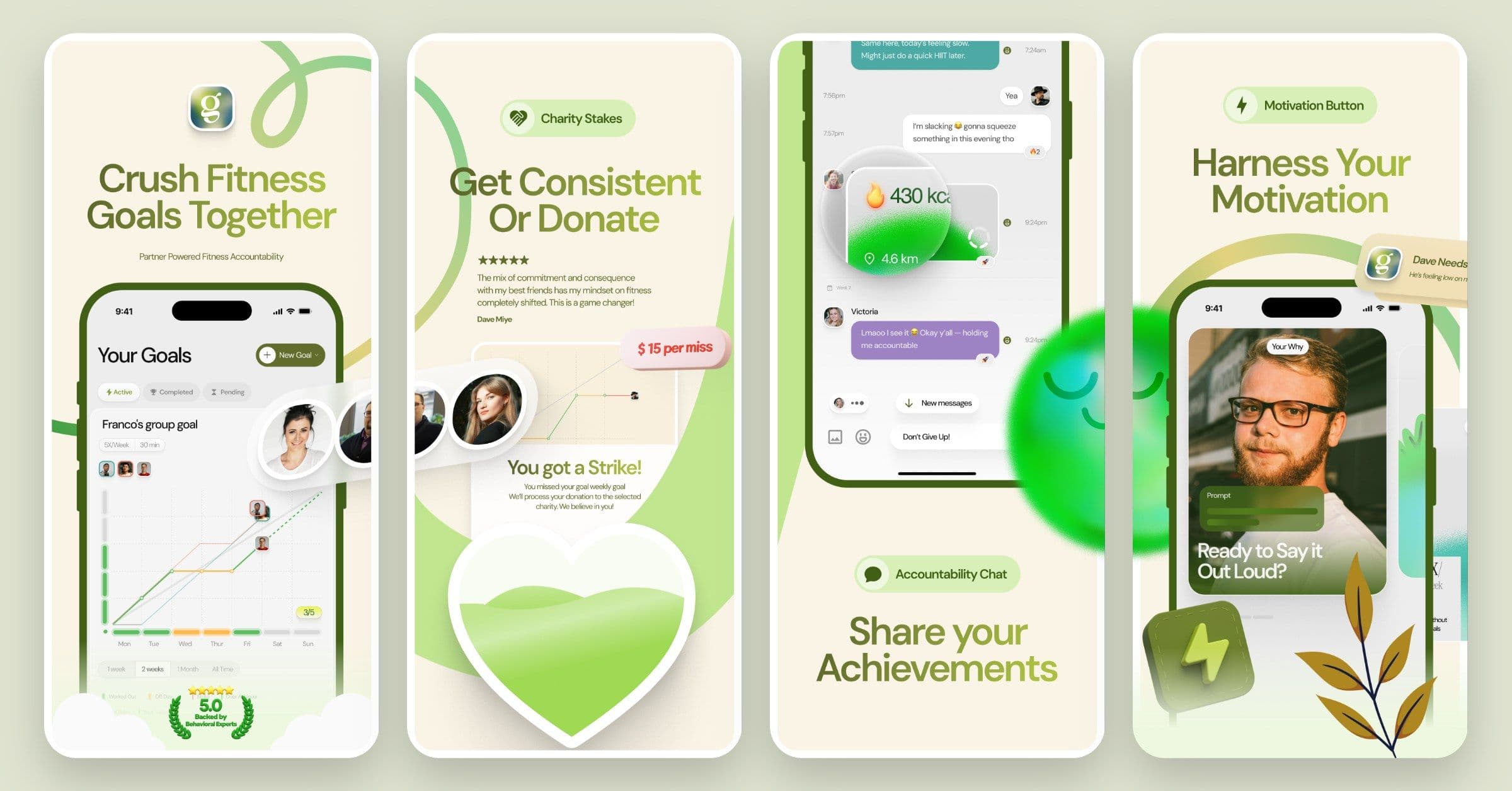
Where it landed
Goals now has thousands of users and a 5.0 rating on the App Store. It also earned places on the Google Cloud for Startups programme and Jason Calacanis’ Founder University in San Francisco, which is good company for a product that started as a slightly brutal idea about going to the gym.
“We worked with Dave for four weeks on a fast-paced design project, and the results exceeded our expectations.” David Harvey and Franco Martins, co-founders of Goals