PLATE
A social app for food and nothing else. I designed the whole product, about 150 screens from first launch to leaderboard, along with its store listings and pitch deck.
- Role
- Product Designer
- Services
- Product Design, App Store Screenshots, Pitch Deck Design
- Scope
- About 150 screens across 10 flows
The problem
Great food gets lost on social media. It sits between holiday photos, memes and ads, and whoever cooked it or found it gets a quick like before the feed moves on. If you want somewhere to eat tonight, you have to scroll past everything else first.
PLATE gives food its own home: a social app where every post is a dish and everyone there came hungry. The line on the first screen sets the tone: “Capture the craving.”
What I did
I designed PLATE end to end. That covers the full product, about 150 screens across 10 flows, the App Store and Google Play listings that sell it, and the pitch deck. The deck is confidential, so it stays out of this page. Everything else is below.
How I worked
I mapped the journey before I drew the interface: open the app, find food, post your own, share it, come back. That map decided what the navigation had to hold, and it kept 150 screens feeling like one product.
From there I explored, with old and new versions side by side and A and B directions on the same board. A style guide kept the decisions consistent as the file grew. Version 1.1 then went deeper, adding posts with up to four photos, a fuller Explore page and competitions.
Getting in
Onboarding opens on food and a promise: “Find your next obsession through the lens of the city’s best foodies.” After that it asks only for what PLATE needs, which is your name, your date of birth and a handle.
Claiming a handle feels like a small win, so I gave it its own step, with suggestions and a clear “@miyeplate is available” when you land on a good one.
Location is the sensitive ask, so the value comes first: “Discover trending dishes and hidden gems in your neighbourhood.” The system prompt appears only after that. Say no and nothing breaks. The feed keeps a quiet See Posts Near You prompt, so you can change your mind whenever you like.
A feed that makes you hungry
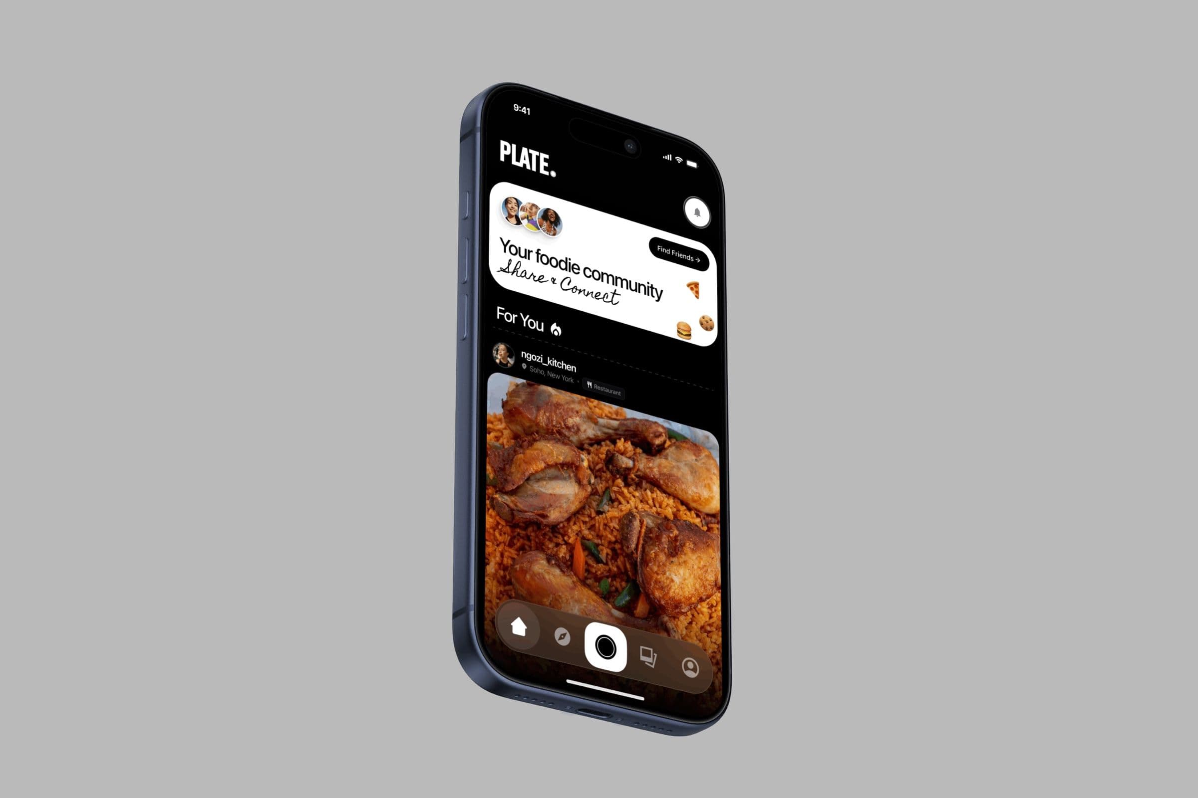
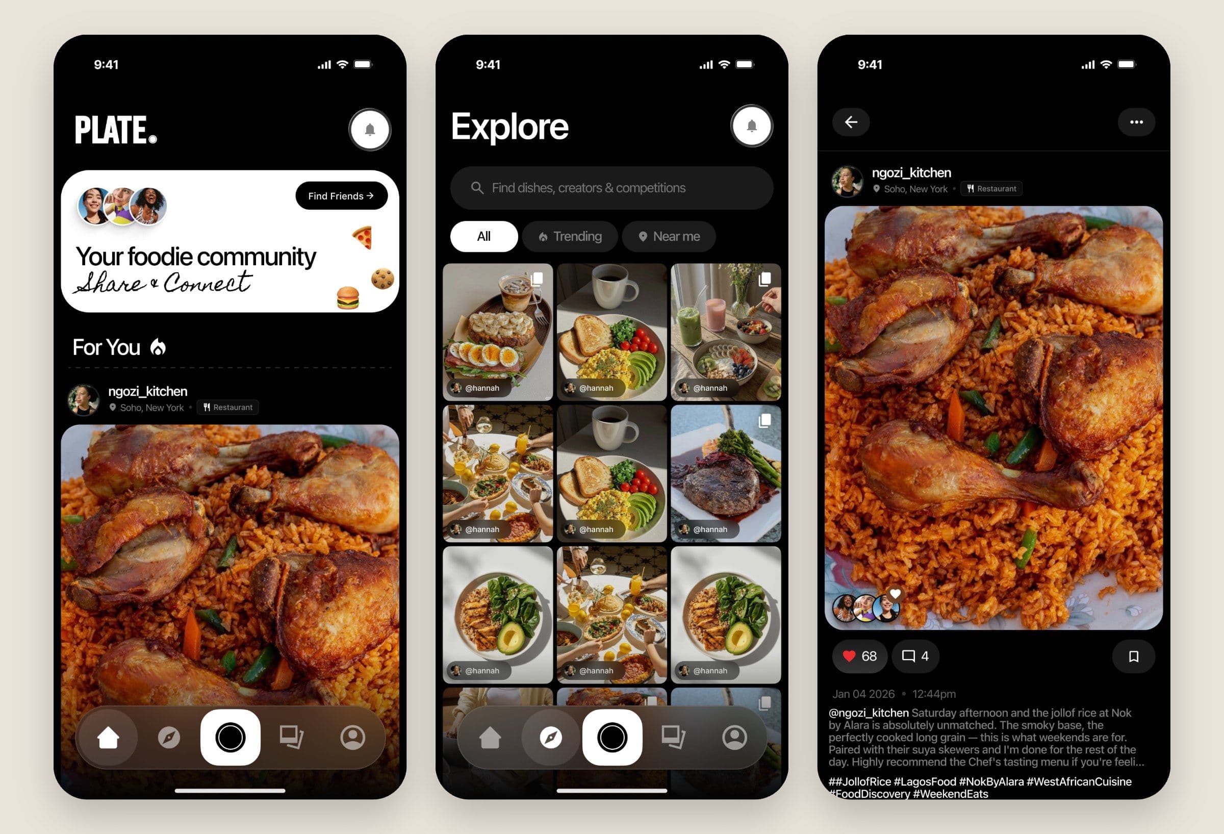
The interface is near-black and keeps quiet, so the food supplies all the colour. Photos run large and the navigation floats over them on a single bar. A single card at the top, Your foodie community, gives new people one thing to do: Find Friends.
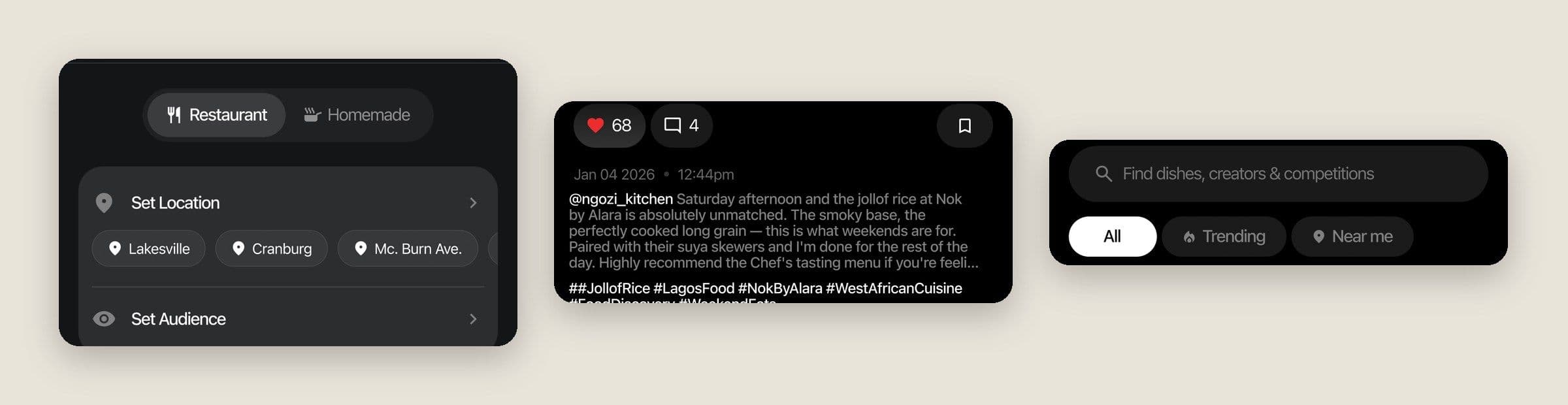
Every post carries a location and a tag saying Restaurant or Homemade, so a jollof you can go and order never gets confused with the one your friend cooked. Posts hold up to four photos, with a layout for each count. When you run out, the feed says so and points you to more foodies to follow, so the scroll ends on something to do.
Explore
Explore does three jobs: browse, search and compete. The search bar names exactly what you can find, “Find dishes, creators & competitions”, and pills for Trending, Near me and Competitions cut the page without losing your place. Where a dish is matters as much as how it looks, so Near me gets the same weight as Trending.
Further down, the page mixes categories, trending posts, Discover Creators and local picks like Trending From Lagos, so there’s always a next thing to tap. Search suggests as you type, and when it comes up empty, No Results Yet offers something else to try.
The camera sits in the middle
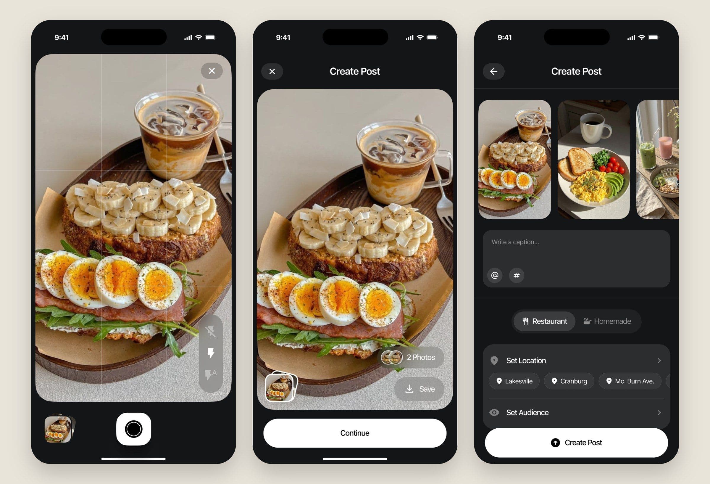
Posting is the main event, so the shutter takes the centre of the nav bar and it’s the brightest thing on the screen. You shoot a few photos, check them, then make every decision that’s left on one screen: caption, Restaurant or Homemade, location and audience. Nearby places appear as chips, so tagging where you are takes one tap.
The risks get plain words. Set Location tells you that people viewing the post will see it. Set Audience lets you “Choose who gets to view this post.” Back out halfway and PLATE asks “Leaving Already?” and offers to save a draft, so a good photo never gets lost to a mistap.
The part I’m proudest of
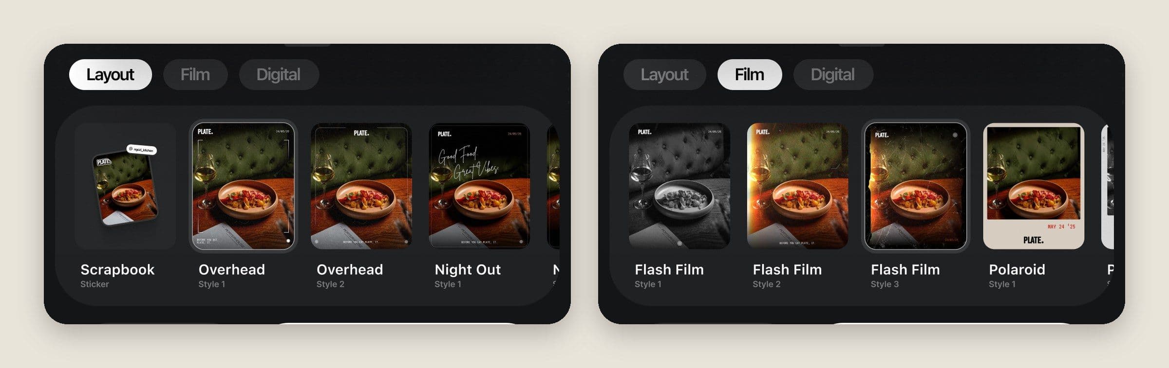
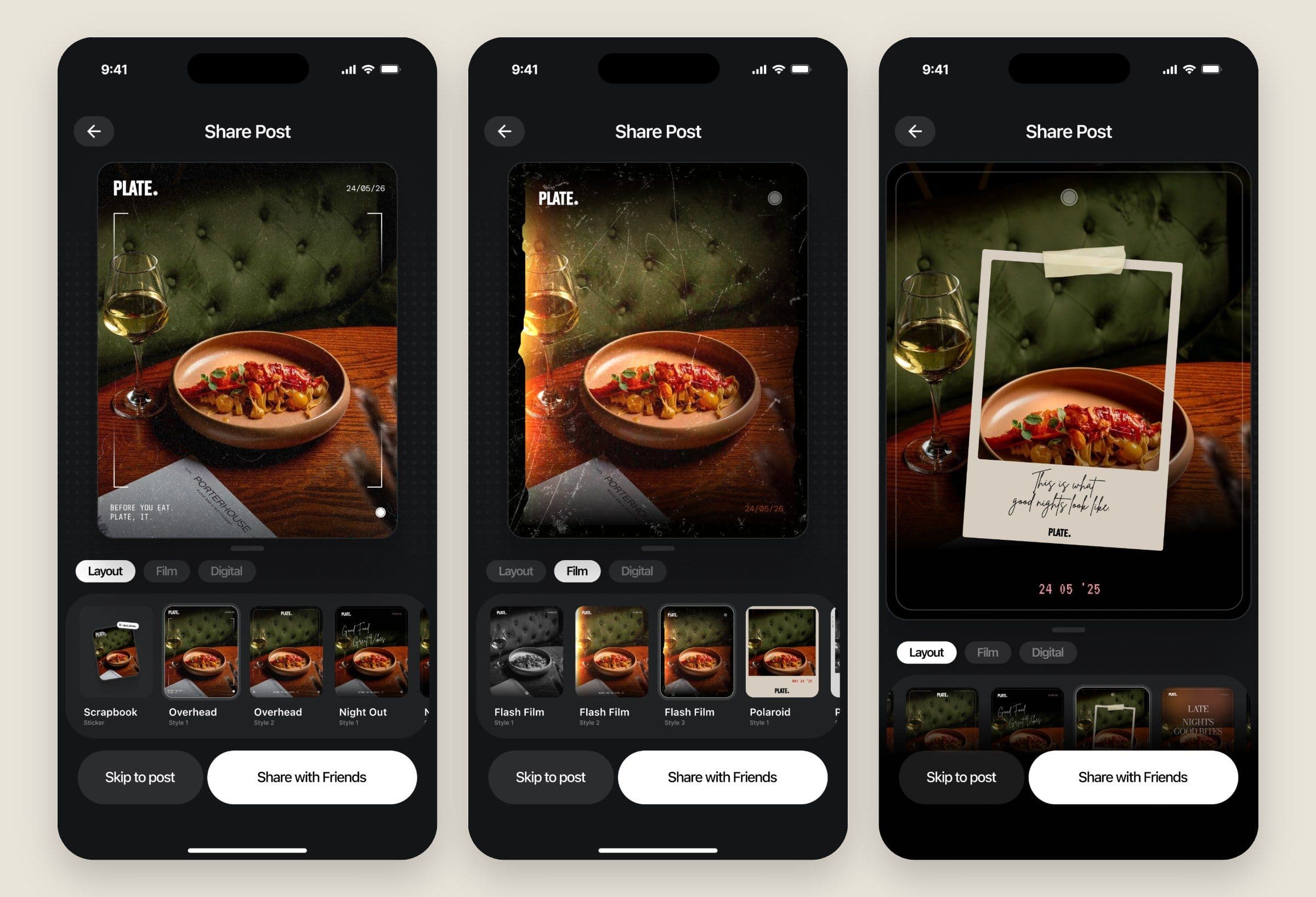
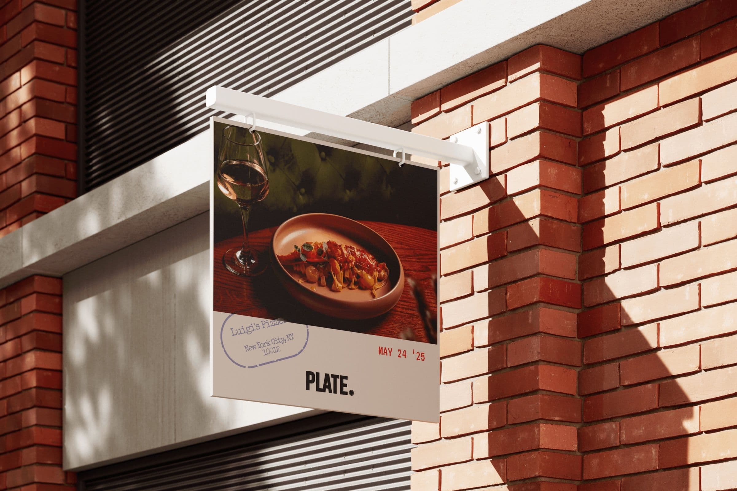
Most apps treat sharing as a link. I pushed this one the furthest. Once you post, PLATE turns your photo into a designed card, with more than a dozen styles across Layout, Film and Digital: a scrapbook sticker, an overhead shot with a date stamp, scratched flash film, a taped-up Polaroid, a camera readout.
Each card carries the PLATE name, so every one that lands on Instagram or WhatsApp advertises the app while looking like something you’d want to post anyway. That’s growth built into the design. The share sheet covers the places people already are, and Skip to post stays one tap away for anyone who’d rather not.
A reason to come back
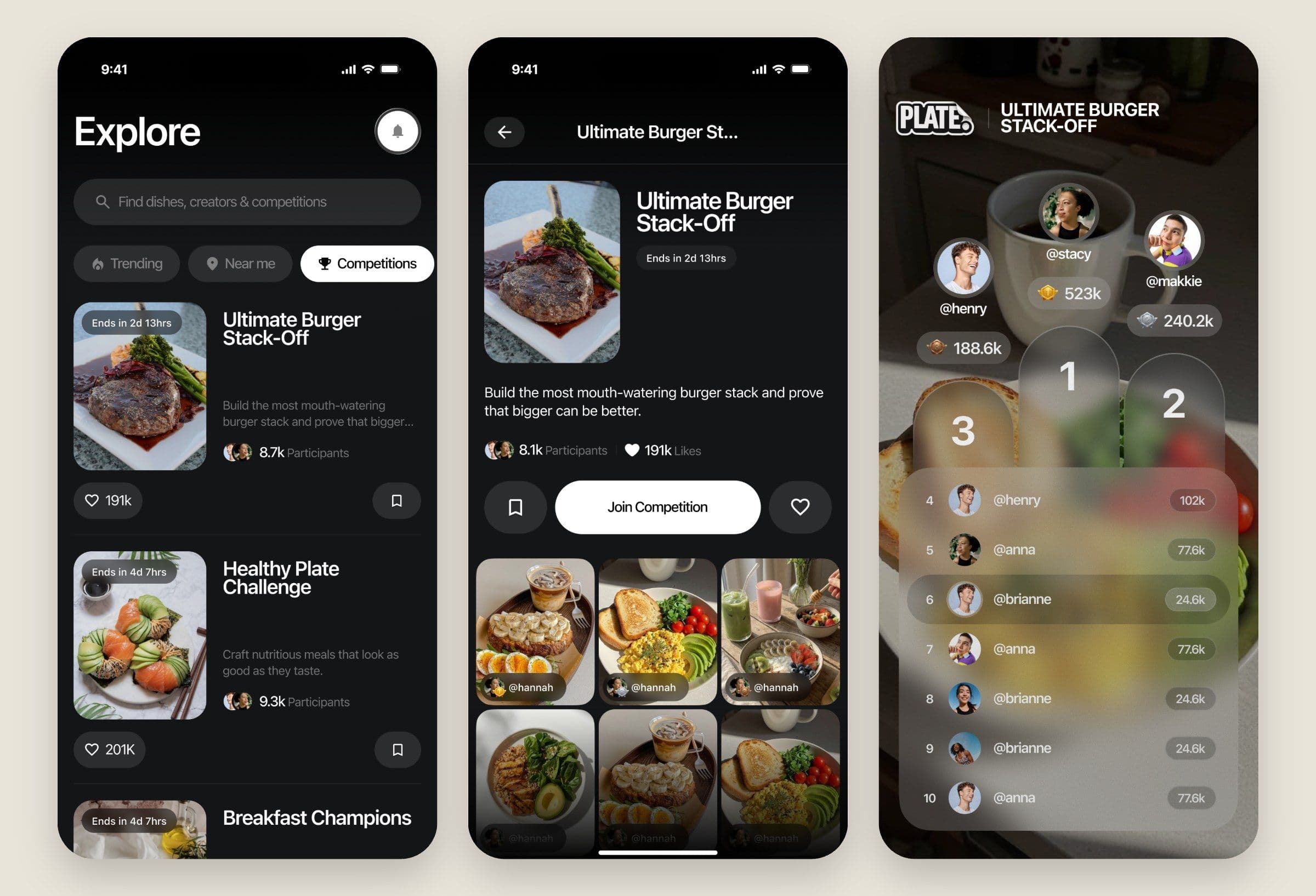
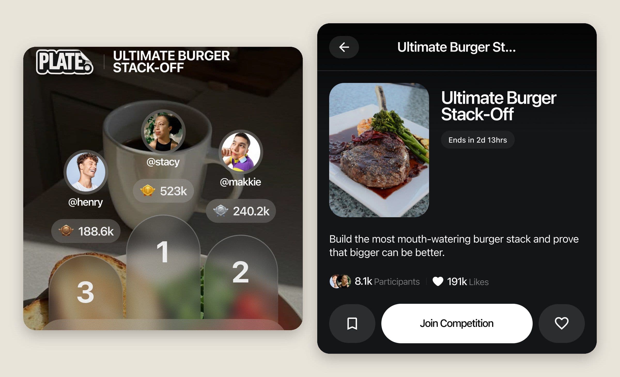
A feed gets people looking. Competitions get them cooking. Challenges like the Ultimate Burger Stack-Off run on a visible countdown, with the entries right there on the page and Join Competition as the one bright button.
The leaderboard is where the product gets to show off. The top three stand on a real podium over a photo of the food, and everyone else sits on a frosted list below. A notification then tells you you’re #3 in the Best Homemade Jollof Challenge, with See Leaderboard right beside it, and you’re back in the kitchen.
Profiles and privacy
Your profile is your record of what you’ve eaten, and the Photos tab keeps your uploads and drafts together. A new account sees “Upload your first dish” and Open Camera, so an empty page still gives you the next step.
Private accounts got proper attention. Switch to Private spells out what changes: only people you approve can see your Plates, collections and follower list, and your existing followers won’t be affected. Follow requests arrive in one place with Approve All and Decline All. Delete Post says exactly what will happen: permanently deleted, and it can’t be recovered.
The screens nobody screenshots
A community needs its awkward moments designed too, so reporting and blocking got the same care as the feed. The reasons you can pick are specific to this product, and they include “Stolen or uncredited content”, because here the photo is the whole post.
After a report, PLATE confirms what happens next and offers to block that person while you’re there. The block dialog tells you what they’ll lose and says plainly that they won’t be told. These are the screens people meet when something has gone wrong, so the words stay calm and specific.
Notifications
Notifications only help if people keep them on, so Preferences splits them into seven types: Likes & Engagement, Follows, Mentions & Tags, Competitions, Nearby Activity, Featured & Growth and System Updates. Each one gets a line saying what it’s for. Before any arrive, the page says “Nothing happening yet” and suggests posting or joining a challenge.
Selling it in six frames
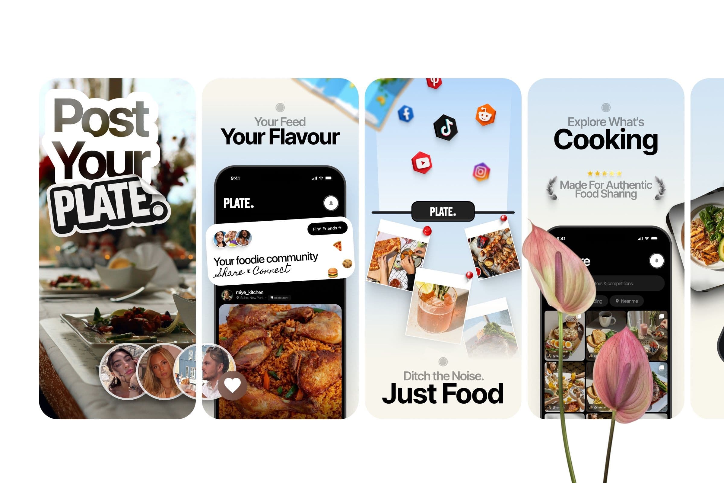
I finished with the store listings, because that’s where the idea has to land in seconds. The set runs as one continuous story: Post Your Plate, Your Feed Your Flavour, Explore What’s Cooking, Snap, Plate & Share, Show Off Your Masterpiece. The strongest line came from the problem I started with: “Ditch the noise. Just food.”
What I’d watch next
PLATE’s design makes two bets, and I’d want to see both in the numbers: that people will share their cards outside the app, and that competitions bring them back. Those two loops are why the product looks the way it does, and they’re the first things I’d measure.